
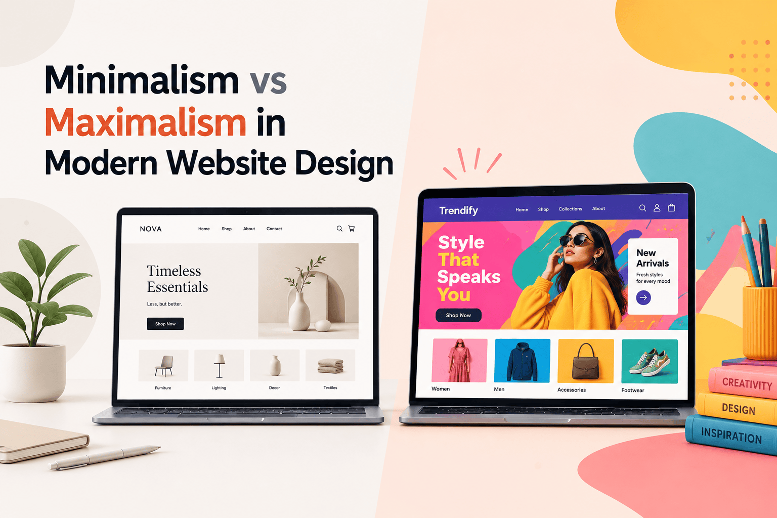
Minimalism vs Maximalism in Modern Website Design
Two founders launched their brands in the same month. One built a site that looked almost like Apple’s – a single product shot, acres of white space, one line of copy, one button. The other went the opposite direction entirely: saturated colour, overlapping images, bold type stacked on bold type, something new to notice every time you scrolled. Both sites did well. Both got written up in design blogs. And both founders were, at different points, told by someone that their approach was “outdated” and they should switch to the other one.
That contradiction is exactly why the minimalism vs maximalism question keeps coming up, and why most articles about it don’t actually settle anything – they just show you pretty examples of each and leave you to guess which one applies to you. It’s not really a style debate. It’s a question about what your specific brand, audience, and goal actually need from a website, and the honest answer is that either approach can be the right one, depending on facts about your business that a “top 10 trends” listicle has no way of knowing.
This guide breaks down what minimalism and maximalism in website design actually mean beyond the surface look, where each one measurably wins (and where the claims get exaggerated), and a straightforward way to decide which fits your brand – with real examples either way.
Quick Answer
Minimalism in web design means intentionally including only what serves the user or the message – clean layouts, restrained colour, generous white space – and it tends to win on page speed, SEO performance, and clarity for goal-driven, conversion-focused sites (SaaS, finance, tech, professional services).
Maximalism means deliberately layering bold colour, texture, and visual density to create an immersive, memorable brand experience, and it tends to win on engagement, session duration, and emotional connection for brands built on personality and storytelling (fashion, entertainment, hospitality, creative industries). Neither one is “the future” of web design – 2026’s real trend is both approaches maturing and coexisting, with hybrid styles borrowing from each.
What Minimalism Actually Means in Web Design?
Minimalism is often misunderstood as simply “a website with not much on it,” but that’s not quite right. A well-built minimalist site isn’t bare because there was nothing to add – it’s restrained because every element that could have been included was deliberately left out unless it served the user’s task or the brand’s message.
Apple’s product pages are the reference example almost every design article reaches for, and for good reason: a page selling a $1,000+ device usually has one hero image, one line of copy, and one clear next step, trusting the product photography and white space to do the persuading instead of stacking on extra visual noise.
The core building blocks are consistent across good minimalist sites: a restrained colour palette (often one or two accent colours against a neutral background), generous white space used as an active design tool rather than empty filler, strong typographic hierarchy so the most important text is obviously the most important, and simplified navigation that removes secondary distractions from the primary path to conversion.
Where minimalism earns its reputation is performance. Fewer images, fewer fonts, fewer animation libraries, and less JavaScript genuinely do produce lighter pages – and page speed has a well-documented relationship with conversion: a one-second increase in load time is commonly associated with around a 7% drop in conversions, and a large share of users report abandoning a page that takes more than a few seconds to load.
That performance advantage compounds into SEO too, since Core Web Vitals (a ranking factor) reward exactly the lightweight, fast-loading pages minimalism naturally produces.
What Maximalism Actually Means in Web Design?
Maximalism isn’t the absence of restraint – done well, it’s the opposite of clutter, even though it looks nothing like minimalism on the surface. A good maximalist site orchestrates layering, contrast, and visual hierarchy on purpose, aiming for a feeling of curated abundance rather than a page where everything was added without a plan.
Gucci’s website is a frequently cited example: full-width campaign imagery, a custom serif headline typeface that shifts in tone with each seasonal collection, and colour palettes that swing from moody dark tones to saturated brights depending on what’s being launched – but it’s still navigable, because the underlying structure stays consistent even as the visual dressing changes.
Spotify and Liquid Death are two other brands regularly held up as maximalist done right, both using overlapping visuals, bold typography, and layers of texture specifically to make their sites feel distinct in categories full of near-identical competitors.
The building blocks of maximalism: rich, often high-contrast colour combinations, layered visual elements (overlapping images, textures, competing typography sizes used deliberately), asymmetrical or unconventional layouts that break from a strict grid, and motion or interactive elements that reward exploration instead of just presenting information flatly.
The trade-off is the mirror image of minimalism’s advantage: more visual elements generally means heavier pages, and if animations, large images, and custom fonts aren’t optimised carefully, load times and Core Web Vitals scores suffer. This is the single most common way maximalist sites fail – not because the aesthetic was wrong, but because performance was treated as an afterthought instead of something designed around from the start.
Minimalism vs Maximalism: The Real Comparison
| Features | Minimalism | Maximalism |
| Core philosophy | Remove everything that doesn’t serve the user or the message | Layer richness and detail to create an immersive brand experience |
| Typical page weight/speed | Lighter, faster by default | Heavier unless carefully optimised |
| SEO/Core Web Vitals | Generally easier to score well | Requires deliberate optimisation to compete |
| Best-suited industries | SaaS, finance, healthcare, professional services – anywhere trust and clarity drive the decision | Fashion, entertainment, hospitality, creative/lifestyle brands – anywhere emotion and personality drive the decision |
| Conversion strength | Strong for direct, single-goal conversion paths (sign up, request a quote, buy now) | Strong for engagement, session duration, and brand recall over a single conversion moment |
| Maintenance | Fewer moving parts, generally easier to update | More assets and interactions to keep current |
| Risk if done poorly | Feels unfinished, generic, “template-like” | Feels cluttered, slow, and disorienting |
| Real examples | Apple, Google, most modern SaaS homepages | Gucci, Spotify, Zara, Liquid Death |
Minimalist Website Design vs Conversion Rate Claims: The Real Numbers
A lot of articles on this topic throw around big numbers – “minimalist redesigns boosted conversions by 261%,” “up to 400% more sales” – and it’s worth being straight about those.
Numbers like that almost always come from one specific case study, on one specific site, with a specific starting point (often a genuinely broken, cluttered original design), not a general rule that applies to any business that goes minimalist.
What’s actually well-supported across many sources is more modest and more useful: reducing decision fatigue (fewer navigation choices, a single clear call-to-action) reliably reduces bounce and hesitation, and faster pages reliably convert better than slow ones, regardless of which aesthetic produced the speed.
Treat any single “X% increase” statistic you see quoted – including some of the more dramatic ones circulating in the design blog world right now – as a best-case anecdote, not a guarantee for your specific site.
Where Maximalism Genuinely Outperforms Minimalism?
The reverse claim deserves the same honesty. Maximalist ecommerce and content-driven sites are commonly reported to see meaningfully higher average session duration and engagement with content-rich pages compared to stripped-down layouts – which makes sense, since a maximalist site is often explicitly designed to be explored, not just scanned and acted on.
For a fashion retailer, an entertainment brand, or a hospitality business, time spent and emotional engagement often matter as much as – or more than – a single fast conversion, because the sale itself may happen after several visits, or the goal of the page is brand memory rather than an immediate click.
This is really the heart of the whole debate: minimalism optimises for the shortest possible path to one action; maximalism optimises for a memorable, explorable experience that pays off over a longer relationship with the brand. Judging a maximalist fashion site by “did it convert in one visit as fast as a SaaS sign-up page” is measuring it against a goal it was never built for.
The 2026 Twist: Neither Side Is “Winning”
Design commentary earlier in the 2020s tended to frame this as minimalism giving way to maximalism, or vice versa, like a pendulum swing. The more accurate picture emerging through 2026 is pluralism – both approaches maturing and succeeding at the same time, in different corners of the industry, often borrowing from each other rather than replacing one another.
Two specific hybrid directions are worth knowing, because they’re recent enough that most general “minimalism vs maximalism” articles haven’t caught up to them yet. The first, sometimes called tactile maximalism, uses 3D textures, grainy gradients, and glassmorphism-style layers alongside oversized, grid-breaking typography – richer than pure minimalism, but built with a “structure first” discipline (simple, always-findable navigation underneath the visual richness) specifically to avoid the clutter problem that sinks poorly executed maximalism.
The second, sometimes called resonant stark, is a more evolved minimalism – not the bare, “empty white page” minimalism of the late 2010s, which increasingly reads as unfinished rather than sophisticated, but a version that earns its restraint through sharper hierarchy, subtle micro-interactions, and soft gradients layered carefully on top of a still-simple structure.
The practical takeaway: if you’re choosing between these two philosophies for a build in 2026, you’re not actually limited to a binary choice. A B2B SaaS brand can borrow maximalism’s use of bold typography and motion in its hero section while keeping the rest of the site fast and minimal. A fashion brand can be maximalist in its imagery and colour while keeping navigation and checkout deliberately simple underneath it. The best-performing sites we’ve seen recently rarely sit at the end of either label.
How to Decide Which Approach Fits Your Brand?
Run through these questions honestly before picking a direction:
- What’s the primary goal of this page? A single, fast conversion action (sign-up, purchase, lead form) leans minimalist. Building brand memory and emotional connection over a longer relationship leans maximalist.
- What does your audience expect from your category? A fintech or healthcare brand leaning maximalist fights an uphill battle against expectations of trust and clarity. A streetwear or entertainment brand leaning minimalist risks looking generic in a category where personality is the product.
- How much design and development budget do you have for ongoing upkeep? Minimalist sites are generally cheaper and faster to maintain. Maximalist sites need more ongoing attention to keep imagery, animation, and content feeling current rather than dated.
- How important is page speed to your specific business? If a large share of your traffic comes from mobile search and organic SEO, minimalism’s performance advantage is doing real, measurable work for you. If most traffic arrives already primed to browse (social, direct, paid campaigns with strong intent), a slightly heavier, more immersive maximalist experience is less of a liability.
- Can you actually execute your chosen direction well? A poorly built minimalist site looks unfinished and generic. A poorly built maximalist site looks cluttered and slow. Neither failure mode is really about the philosophy – both come down to execution.
If you’ve read this far and you’re still genuinely unsure which fits your brand, that’s a reasonable place to land – the honest answer usually depends on specifics (your industry, your traffic sources, your team’s ability to maintain either approach) that a self-assessment can only get you partway toward. This is exactly the kind of brand-and-goal conversation we have with clients before recommending a direction at Ganatra Info, rather than defaulting every client to whichever style is trending that quarter.
Common Mistakes on Both Sides
- Copying the aesthetic without the discipline behind it. A minimalist site built by simply removing elements, without a clear hierarchy for what remains, ends up looking unfinished rather than intentional. A maximalist site built by adding elements without a structural plan underneath ends up cluttered rather than immersive. The visible style is the easy 20% to copy; the underlying decision-making is the hard 80% that actually makes it work.
- Ignoring performance until after launch. Minimalist sites get their speed advantage “for free” structurally, but maximalist sites need images compressed, animations optimised, and scripts audited from day one – treating performance as a post-launch fix instead of a build-time requirement is the single most common reason maximalist sites underperform.
- Choosing a style based on what a competitor did, not on your own goal. A style that worked for a competitor’s audience and traffic mix doesn’t automatically transfer to yours – the decision framework above is a better starting point than “our biggest competitor redesigned, so we should too.”
- Assuming the choice is permanent. Plenty of brands shift emphasis over time – leaning more minimal during a rebrand focused on trust, or more maximal during a campaign focused on cultural relevance. Treating the choice as a single permanent decision, rather than something that can evolve with the brand, often locks a site into an aesthetic that made sense two years ago but doesn’t anymore.
Getting the Balance Right of Minimalism and Maximalism
Minimalism and maximalism aren’t opposing teams to pick a side of – they’re two different tools solving two different problems: one optimises for speed and clarity toward a single action, the other optimises for immersion and memory over a longer relationship with a visitor.
The brands that get the most out of either approach are the ones that picked it deliberately, based on their actual audience and goal, and then executed it with real discipline – not the ones that simply followed whichever aesthetic was trending in design blogs that year.
If your current site’s design might already be costing you conversions – regardless of which side of this debate it falls on – our breakdown of Shopify UI/UX design tweaks covers the specific, measurable fixes that matter most for ecommerce stores, whichever aesthetic direction you land on.
If you’re weighing this decision for an upcoming build or redesign, a short conversation with a designer who’ll ask about your audience and goals before touching a mockup is worth more than another round of trend research. ganatrainfo offers a free design consultation to help map the right direction for your specific brand.
FAQ
Is minimalism or maximalism better for ecommerce websites?
It depends on the category and price point. Minimalism tends to suit niche or premium product ranges where a small number of hero products deserve full attention, while maximalism tends to suit large, diverse ecommerce catalogues where visual richness helps communicate variety and brand personality. Neither is universally “better” – the deciding factor is usually your product range and audience expectations, not a general rule about ecommerce as a category.
Does minimalist web design really load faster than maximalist design?
Yes, structurally – fewer images, fonts, and scripts mean less for a browser to load, so minimalist sites tend to be faster by default. Maximalist sites can still load quickly, but it takes deliberate optimisation (compressed images, efficient animation, careful script management) to achieve, rather than happening automatically the way it does with a lighter minimalist page.
Is maximalism just a passing trend, or is it here to stay?
Maximalism has returned in cycles for decades in design generally, and its current resurgence in web design is being driven by real factors – audiences fatigued by years of near-identical minimalist templates, and brands wanting a more distinctive, memorable presence. Rather than expecting it to fully replace minimalism, the more accurate read is that both approaches are maturing and coexisting, with hybrid styles increasingly common.
Can a website combine minimalism and maximalism?
Yes, and many of the best-performing sites already do – using a bold, maximalist hero section or campaign imagery while keeping navigation, product pages, and checkout deliberately simple and fast underneath. The goal in a hybrid approach is usually to get maximalism’s emotional impact in a few key visual moments without sacrificing the speed and clarity minimalism provides everywhere else.
Which big brands use minimalist web design, and which use maximalist?
Apple and Google are the most commonly cited examples of minimalist web design, built around a single clear message and generous white space. Gucci, Spotify, and Zara are frequently cited maximalist examples, using bold colour, layered imagery, and expressive typography to create an immersive brand experience rather than a strictly functional one.
How do I know if my website is too minimal or too cluttered?
A useful test is whether a first-time visitor can state your core message and next step within a few seconds of landing on the page. If they can’t, and your site looks sparse, it may be under-designed rather than intentionally minimal. If they’re distracted or overwhelmed before finding that message, your maximalism has tipped into clutter. Either way, the fix isn’t switching styles – it’s tightening the hierarchy within the style you’ve chosen.