
Shopify UI/UX Optimization: 10 Design Tweaks That Double E-Commerce Conversions
A store owner we spoke with was running a steady ad budget every month, and traffic was climbing every week – 12,000 visitors, then 18,000, then 25,000. Sales barely moved. Her instinct was to spend more, because more traffic had always meant more sales before.
It wasn’t a traffic problem. When we pulled her Shopify analytics, the story was obvious the moment you looked at it the right way: visitors were landing, scrolling for four seconds, and leaving. Her conversion rate was sitting at 0.6% – a third of what a reasonably healthy store should be seeing. She didn’t have a marketing problem. She had a Shopify UI/UX optimization problem, and no amount of extra traffic was going to fix it.
This is the situation this guide is written for. If you’re driving decent traffic and still watching a conversion rate that doesn’t move, the fix usually isn’t a full redesign or a new theme – it’s a specific, identifiable set of UI/UX optimization decisions that are quietly costing you sales on every single visit. Below are 10 of them, based on what actually moves the needle in real Shopify stores, not generic “improve your UX” advice you’ve already read five times.
Quick Answer
The highest-impact Shopify UI/UX changes are the ones that remove friction at the exact moments visitors decide whether to keep going or leave: a clear single-message hero instead of a rotating banner, a sticky add-to-cart bar on mobile, trust signals placed right next to the buy button instead of buried below it, upfront pricing before checkout, and a genuinely fast-loading page. None of these require a full redesign – most can be implemented on an existing Shopify theme within days, and together they typically move a store from a low conversion rate (under 1%) toward the 2–3% range considered healthy for ecommerce.
What Is Ecommerce UX/UI?
The two terms get used interchangeably, but they’re not the same thing, and mixing them up is why some “redesigns” make a store look better without making it sell better.
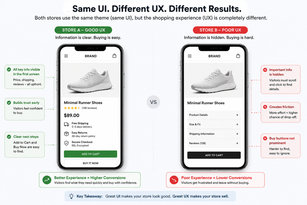
UI (User Interface) is what the visitor sees and clicks: button colours, font choices, image layout, the visual style of your theme. UX (User Experience) is the entire journey behind that interface: how many steps it takes to buy something, whether the visitor can find what they’re looking for, whether the checkout feels fast or exhausting. A store can have excellent UI – a beautiful, on-brand theme – and still have poor UX if that beautiful theme buries the Add to Cart button, hides shipping costs until the last step, or takes six clicks to reach checkout.
A quick example makes the difference concrete. Two Shopify stores selling the same product might both use the same premium theme (identical UI). Still, Store A shows the price, shipping estimate, and reviews all in the first screen a mobile visitor sees, while Store B makes the visitor scroll and tap through several sections to find the same information. Same visual design, very different UX – and very different conversion rates, even though a quick glance at either homepage would suggest they’re equally “well designed.”
Ecommerce UX/UI, together, cover the full experience of shopping on your Shopify store – from the first impression on the homepage to the final tap that completes an order. Design that only optimizes for how the store looks, without optimizing for how it works, is solving half the problem.
How Does UX Impact Conversion Rate, Cart Abandonment, and Retention?
Every UX decision on a Shopify store shows up in one of three places: whether a visitor converts, whether they abandon their cart, or whether they come back again. These aren’t separate metrics – they’re connected, and a UX problem usually shows up in more than one of them at once.
Conversion rate is the most direct measure. A confusing homepage, a slow-loading product page, or a checkout that asks for too much information all reduce the percentage of visitors who complete a purchase – not because the product or price was wrong, but because the path to buying it had too much friction.
Example: a visitor on a mobile device lands on a product page where the Add to Cart button disappears once they scroll to read the description. If they don’t scroll back up, that’s a lost sale caused entirely by layout, not by the product.
Cart abandonment is where UX friction becomes visible in a very specific way – a customer decided to buy, added the item, and still left. Ecommerce cart abandonment rates across the industry commonly run in the range of 70%, and a large share of that is tied directly to UX issues: shipping costs revealed too late, an account creation requirement, a checkout with too many form fields.
Example: a store that only reveals shipping costs on the final checkout page will consistently lose customers at that exact step, even if everything before it worked well – the abandonment data will show a spike at checkout, and the cause is UX, not price.
Retention is the slower-moving, easy-to-overlook impact of UX. A customer who has a fast, easy-to-navigate experience is more likely to come back for a second purchase; a customer who fought through a confusing site to buy once often won’t give it a second chance, even if they liked the product.
Example: a store with a cluttered account/order-tracking page might complete the first sale fine, but lose the customer at the post-purchase stage, where a frustrating experience checking an order status quietly erodes the trust that would have brought them back.
The pattern across all three: UX problems rarely show up as a single obvious failure. They show up as a slightly worse number in several places at once – which is exactly why a systematic audit, not a guess, is the right way to find them.
10 Shopify UX Design Tweaks for E-Commerce Conversion Optimization
1. Fix Your Homepage Hero – One Message, One Action
Most underperforming Shopify homepages try to say five things at once: a discount banner, a brand storyline, a “shop new arrivals” button, a newsletter popup, and a hero image that doesn’t clearly connect to any of them. A visitor given five choices in the first three seconds usually makes none of them.
The fix is a single, clear hero: one sentence that tells the visitor what you sell and why it matters to them, and one button that takes them somewhere specific – your best-selling collection, not a generic “Shop Now” that dumps them on an unsorted catalogue.
This is one of the simplest pieces of conversion-focused web design to implement and consistently one of the highest-impact, because it’s fixing the very first decision point on your entire site.
2. Kill the Auto-Rotating Carousel
Rotating banner sliders are still common on Shopify homepages, and they’re one of the most well-documented UX mistakes in ecommerce design. Visitors decide whether to keep scrolling within the first couple of seconds – long before a slider has rotated to its second or third slide – so anything placed on slide two or three is effectively invisible to most visitors. Worse, sliders slow down page load, directly working against the speed numbers above.
Replace it with a static hero and, if you have more than one message to convey, stack them vertically below the fold instead of hiding them in a rotation.
This is a small technical change with an outsized effect on both Shopify UI clarity and page speed.
3. Add a Sticky Add-to-Cart Bar for Mobile
On a typical Shopify product page, the “Add to Cart” button sits above the fold on desktop and disappears the moment a mobile visitor scrolls down to read the description or reviews – exactly when the majority of your traffic is browsing.
A sticky bar that keeps the product name, price, and Add to Cart button visible while scrolling removes an unnecessary step: scrolling back up to buy.
This is one of the most direct Shopify mobile optimization changes available, because it doesn’t ask the visitor to do anything differently – it just keeps the action available at the moment they decide to take it.
4. Move Trust Signals Next to the Buy Button, Not Below It
Reviews, security badges, and return-policy mentions are common on Shopify product pages – but they’re often placed at the bottom of the page, after the description and specifications, where a hesitant visitor has already left before scrolling that far. The doubt that makes someone hesitate (“is this legit,” “what if it doesn’t fit,” “can I return it”) happens right next to the price and the button, not three scrolls down.
Moving a short trust line – star rating, “30-day returns,” a recognisable payment badge – directly under the Add to Cart button addresses the hesitation at the exact moment it occurs. This single placement change is a core part of real Shopify product page optimization, and it costs nothing beyond a template edit.
5. Show the Full Landed Cost Before Checkout
Unexpected shipping costs revealed for the first time at the final checkout step are one of the most common, best-documented reasons for cart abandonment across ecommerce. Yet a large share of Shopify stores still don’t show an estimated shipping cost or a free-shipping threshold until the customer is several steps into checkout.
Add a shipping estimate on the product page or cart page – even a simple “Free shipping over $75” banner – so the number the customer sees at checkout isn’t a surprise. This is a small addition with a disproportionate effect on Shopify checkout optimization, because it removes the single most common last-minute reason people abandon a cart they were ready to complete.
6. Enable Guest Checkout and Express Payment Buttons
Forcing account creation before checkout is still one of the most avoidable conversion killers on Shopify stores that haven’t reviewed their checkout settings recently. Every extra field and every forced decision between “add to cart” and “order confirmed” is a chance for the visitor to reconsider.
Guest checkout, combined with express payment options like Shop Pay, Apple Pay, and Google Pay placed high in the checkout flow, cuts the number of decisions and form fields a buyer has to get through.
This is Shopify CRO in its most literal form – fewer steps between intent and purchase, not more marketing to compensate for a slow checkout.
7. Replace Static Size Charts With an Interactive Fit Finder
For any store selling sized products – apparel, footwear, jewelry with ring sizing – a plain measurement table asks the visitor to do the hardest part of the decision themselves.
An interactive size or fit finder, even a simple one that compares against a garment they already own, does that work for them and directly reduces the hesitation (and the resulting returns) that comes from sizing uncertainty.
We covered why this matters so much for sizing-heavy categories in our guide to fashion ecommerce development – the UX principle is the same one driving this tweak.
8. Compress and Lazy-Load Every Image
Given that each extra second of load time costs roughly 4.4% of your conversion rate, unoptimized images are often the single biggest technical drag on a Shopify store’s performance. High-resolution product photography is important – but uploading it uncompressed and loading every image on a page at once instead of only what’s currently visible punishes every visitor with a slower page before they’ve seen a single product.
Compress images before upload, use lazy-loading so off-screen images load only as the visitor scrolls to them, and audit installed apps periodically – unused or redundant apps are a common, overlooked source of script bloat that slows Shopify stores down without adding any customer-facing value.
This is foundational Shopify website optimization that most design-focused fixes depend on to actually be felt.
9. Simplify Navigation to What’s Actually Thumb-Reachable
A desktop-style navigation menu with a dozen categories, submenus, and low-priority links (careers, blog, press) crammed in doesn’t translate well to a mobile screen, where every tap costs more effort than a mouse click.
Good eCommerce UX on mobile means a navigation menu built around what actually drives sales – top categories, current promotions, delivery information – with lower-priority links moved to the footer instead of competing for space in the primary menu.
This isn’t about removing information the customer needs. It’s about making sure the menu that loads by default on a 6-inch mobile screen is built for buying, not for browsing everything your business does.
10. Add Bundles or “Frequently Bought Together” to the Product Page, Not Just the Cart
Many Shopify stores only introduce cross-sells at the cart stage, after the customer has already made their primary decision. Showing relevant bundles or “frequently bought together” combinations directly on the product page – while the customer is still actively deciding – captures a share of buyers who would add a second item if it were suggested at the right moment, rather than after they’ve mentally finished shopping.
This doesn’t just lift conversion; it’s one of the more reliable ways to increase average order value from the same traffic, since customers already in a buying mindset are the easiest audience to sell a complementary item to.
How to Measure and Improve Your Shopify UX Over Time?
Shopify UX optimization isn’t a one-time fix – it’s a cycle: measure where visitors are struggling, form a specific hypothesis about why, make one change, and measure again before moving to the next fix. Here’s how that actually works in practice.
Start with your existing data. Shopify Analytics already shows conversion rate, cart abandonment rate, and where in the funnel visitors drop off (product page, cart, or checkout) – that’s usually enough to point you toward which of the ten tweaks above matters most for your specific store, rather than guessing at all ten at once.
Add behavioural tools for the “why.” Analytics tells you where visitors are leaving; heatmap and session-recording tools (like Microsoft Clarity, which is free, or Hotjar) show you why. For example, a heatmap might reveal that mobile visitors never scroll past the hero image at all – which would explain a low click-through to product pages far better than any raw conversion number would on its own, and points directly at fixing the homepage hero (tweak #1) rather than the checkout.
Test one change at a time. It’s tempting to implement all ten tweaks in this guide in one go, but that makes it impossible to know which change actually helped. A simple before/after comparison – implement one fix, give it two to four weeks of comparable traffic, then check whether the relevant metric moved – is a more reliable way to build a store that keeps improving, rather than one that changed a lot and got lucky.
Revisit the audit as your store changes. A UX fix that worked for a 50-product catalogue may not hold as you scale to 500 products, add new categories, or shift more traffic to mobile. Treat Shopify UX as something to reassess every few months, particularly around major traffic shifts like a new ad campaign, a seasonal sale, or a big jump in mobile visitors – rather than a project you finish once and never look at again.
It helps to see the actual numbers before diving into fixes, because they explain why small design details carry so much weight.
One Thing Most Shopify Design Agencies Won’t Mention
Email is still the default channel for cart-abandonment recovery, but it’s increasingly the weakest one. Open rates on SMS and WhatsApp messages run dramatically higher than email – often reported in the 90%+ range versus roughly 20% for email – which makes a WhatsApp or SMS-based abandoned-cart reminder a genuinely under-used lever for Shopify stores, especially for markets like India and Southeast Asia where WhatsApp is already the default way customers communicate. It’s not a replacement for fixing the UI/UX problems above; it’s a recovery net for the visitors who still leave even after you fix them.
Getting This Right on Your Store
These ten fixes aren’t a one-time project you finish and forget – Shopify store design is something that needs revisiting as your traffic, product range, and customer expectations change. But they are, in order, the highest-leverage places to start if your traffic is healthy and your conversion rate isn’t reflecting it.
If you’d rather have someone audit your specific store instead of guessing which of these ten apply to you, this is exactly the kind of work we do for clients at Ganatra Info – a full Shopify UI/UX audit that identifies which friction points are actually costing you sales, not a generic checklist applied blind.
If you’re earlier in the process and still deciding on a platform or planning a build from scratch, our guides to ecommerce platform comparison and category-specific development are worth reading alongside this one.
FAQ
How to increase Shopify conversion rate?
The fastest, most reliable way to increase Shopify conversion rate is to fix friction at the specific points where visitors hesitate or drop off: slow page speed, unclear homepage messaging, hidden trust signals, surprise shipping costs at checkout, and a mobile experience that wasn’t actually designed for mobile. Rather than adding more marketing or traffic, start by auditing your own analytics to find where visitors are leaving, then address those specific pages first.
How to improve Shopify store conversion rate without a full redesign?
Most conversion improvements don’t require a full redesign – they require targeted fixes to existing pages. Adding a sticky add-to-cart bar, moving trust signals above the fold, enabling guest checkout, showing shipping costs earlier, and compressing images are all changes that can be made within an existing Shopify theme, usually within days, without touching the overall design of the store.
What is a good Shopify conversion rate?
Blended averages across all Shopify stores tend to sit around 1.4%–1.8%, but that figure includes a lot of underperforming or abandoned stores. A genuinely healthy, well-optimized Shopify store typically converts in the 2%–3% range or higher, depending on product category, price point, and traffic source. Your own store’s month-over-month trend matters more than comparing against a single industry-wide number.
How much does Shopify UI/UX optimization cost?
Costs range from effectively free (DIY changes within your existing theme editor) to 800–3,000 for a freelancer or small agency pass on the highest-impact pages, up to 3,000–12,000+ for a full audit-and-implementation project with testing. The right budget depends on how many of the friction points above are currently present on your store.
Does a faster Shopify store really convert better?
Yes – this is one of the most well-established relationships in ecommerce UX. Each additional second of page load time is associated with roughly a 4.4% drop in conversion rate on average, and with mobile making up the majority of Shopify traffic, slow-loading image-heavy pages disproportionately affect the largest share of visitors.
Should I hire a Shopify development company or fix these myself?
Simple changes – hero messaging, navigation cleanup, enabling guest checkout – are reasonable to attempt yourself within Shopify’s theme editor. More involved changes, like a sticky add-to-cart bar, a proper size/fit finder, or a full page-speed audit across apps and scripts, are usually faster and more reliably implemented by a Shopify development services team that can also measure whether the change actually improved conversion, rather than assuming it did.